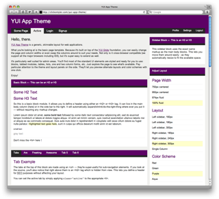
Tonight I pushed a new project to GitHub called yui-app-theme. It’s a generic, skinnable layout designed for web applications — particularly admin areas — built using YUI Grids.
In other words, it’s a starting point.
Usually when doing freelance work for clients, unless you’re building on top of an existing CMS like WordPress or MiaCMS, you’ll have to create an admin area for the client to login and manage their site. Or maybe you’re building a bug tracker or some other web application. Whatever the situation, yui-app-theme provides a solid foundation to start your work.
It offers a tabbed layout with many of the common UI elements that web apps need. Content blocks, tabbed modules, one and two-column forms, error messages, etc. But most importantly it’s built using YUI Grids so it’s semantically structured, cross-browser, and easy to extend. You can radically alter the layout with just a few quick changes. Try clicking through the layout options on the demo page.
I’ve done my best to keep things logical and easy to use. Here’s a quick example of how to use and extend the built-in content blocks.
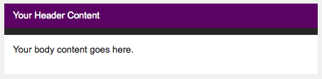
A basic content block, or module, is created with the following markup
<div class="block">
    <div class="hd">
        <h2>Your Header Content</h2>
    </div>
    <div class="bd">
        <p>Your body content goes here.</p>
    </div>
</div>
You have a containing div with a class name of block surrounding two inner divs, which make up the head and body content of the block. In the browser you’ll see
Content blocks resize to fit their surroundings. That means you can take the same markup used for a body content block and move it into a sidebar — the block will automatically shrink to fit the smaller space.
We can also extend the block to have a tabbed appearance. To do this, we just need to add an extra tabs class and define our tabs using a <ul>.
<div class="block tabs">
    <div class="hd">
        <ul>
            <li class="active"><a href="#">Tab 1</a></li>
            <li><a href="#">Tab 2</a></li>
            <li><a href="#">Tab 3</a></li>
        </ul>
        <div class="clear"></div>
    </div>
    <div class="bd">
        <p>Your body content goes here.</p>
    </div>
</div>
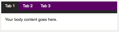
Easy.
However, you’ll notice than by using an unordered list to build our tabs, we had to remove the <h2> tag. In some situations we may want to keep that header around for SEO purposes — visible to search engines but hidden from users. yui-app-theme handles this situation automatically by hiding any <h2> and <h3> tags inside a content block’s header. (Technically, it applies an extreme negative left margin to move it outside the browser window.)
Let’s take this example one step further and change the appearance of the tabs by making them look separated. All we have to do is add a spaces class to the content block.
<div class="block tabs spaces">
    <div class="hd">
        <ul>
            <li class="active"><a href="#">Tab 1</a></li>
            <li><a href="#">Tab 2</a></li>
            <li><a href="#">Tab 3</a></li>
        </ul>
        <div class="clear"></div>
    </div>
    <div class="bd">
        <p>Your body content goes here.</p>
    </div>
</div>
And we get
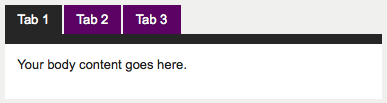
It’s that simple. With the right CSS, minor HTML edits can create powerful changes when rendered.
If you explore the demo you’ll see that applies to the page layout as well. You can very quickly change the color scheme or page width. And even adjust the sidebar, move it to the opposite side, or switch the layout to a single column. It’s all possible because yui-app-theme, itself, is built on top of a solid foundation — YUI.
I’ve already started using this template in my own projects and found it incredibly helpful to have my application layout up and running so quickly. I hope you can benefit from it, too. And, please, feel free to fork yui-app-theme on GitHub and contribute your own improvements.